


The word infographics is thrown about a lot in the office, but it is also a term that isn’t clearly understood by many that use it.
Data is the Latin plural of datum, which means “to give”. Information derived from the verb informare “to inform”.
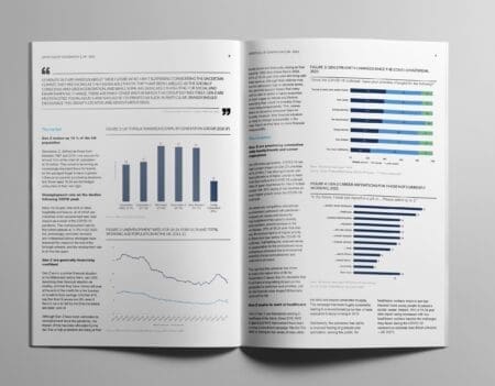
With this in mind, as Mintel starts to explore the process of information design, one simple question has to be asked, is there a difference between data visualisation and an infographic?
A simple definition is needed for both:
-
Information graphics are visual representations of information, data or knowledge often used to support information, strengthen it and present it within a sensitive context. They are specific, context-sensitive and often times hand-crafted.
-
Data visualizations are visual displays of measured quantities by means of the combined use of a coordination system, points, lines, shapes, digits, letters quantified by visual attributes. They are general, context-free and often times created automatically.
The agreement in simple terms; hand crafted vs. points and lines.
So which does Mintel do? (Answers on a postcard