Pantone Color of 2016 could bring more watercolor-inspired design to beauty packaging
Pantone, the global authority on color and provider of professional color standards for the design industries, has chosen two colors as its Color of the Year for 2016: Rose Quartz (#13-1520) and Serenity (#15-3919). Rose Quartz presents as a gentle rose hue, and Serenity as a light blue. Pantone sees the combination of the two as a perfect way to reach harmony and balance, which is much desired going into 2016 after a turbulent 2015. Rose Quartz represents warmth and compassion, while Serenity’s blue tones inspire calmness and relaxation.
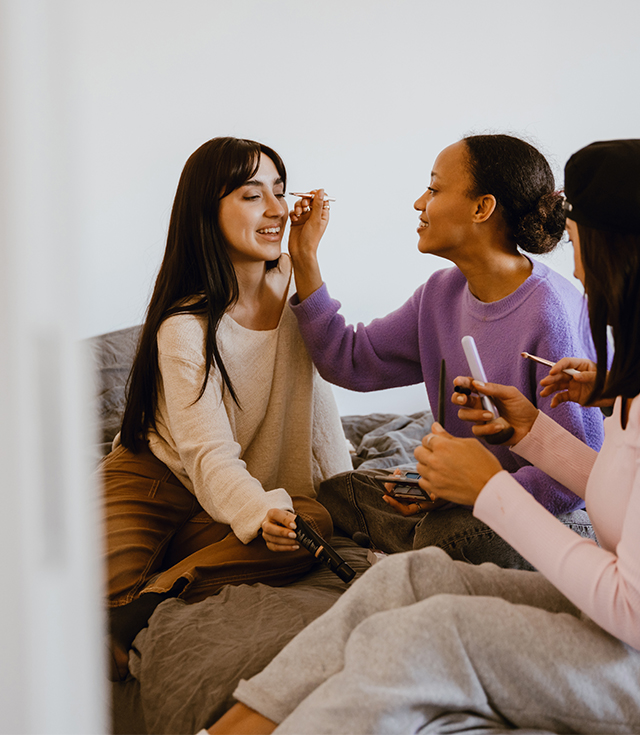
By introducing the two colors, Pantone offers beauty and fashion industries, among many others, color options that suggest balance and reassurance. Indeed, looking at the beauty and personal care consumer, Mintel research show that consumers around the world are searching for balance and well-being when they shop for beauty and personal care products. In the US, nearly half of consumers think that lifestyle influences the appearance of their skin, which is the second most important factor after cleansing. In China, facial skincare users make clear links between lifestyle, fitness and the condition of their skin, with 72% wanting to improve their skin by improving the quality of their sleep, 64% wanting to eat a more balanced diet and 59% wanting to get more exercise.
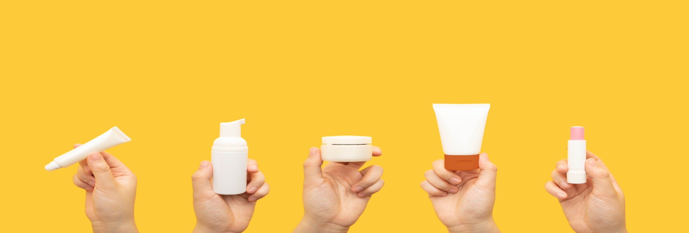
Category and product blurring is not new, and it feels natural that Pantone would blur colors going into 2016. This will present many opportunities for brands to express their values to consumers in the form of novel designs and products. Beauty product packaging is one of the areas where designers have the freedom to express trends, moods and styles through a variety of combinations. Rose Quartz and Serenity should find appeal in all finishes such as matte, metallic and glossy, and be able to convey the message of balance and well-being.
How brands can leverage Pantone colors
In 2016, a variety of combinations of Rose Quartz and Serenity will be used in beauty and personal care launches, as it is common to get inspiration for new collections from Pantone hues. For example, every year Sephora releases limited edition color cosmetics sets with colors and packaging inspired by Pantone. The collection is called “Sephora + Pantone Universe,” and the company has already released the preview for the Rose Quartz and Serenity collection.
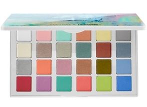
It seems that the beauty industry is especially excited about the new colous for 2016 since they provide a great number of pairing options with mid-tones such as greens and purples. Additionally, Rose Quartz and Serenity match with almost any skin tone. For color cosmetics such as lip, cheek and eye palettes, it represents many opportunities to offer new products. The two Pantone colors used in packaging are also predicted to draw consumer attention with more subtle, calming and natural looks on shelf.
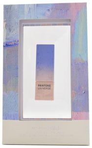
Sephora – Pantone Universe collection 2016
An inspiration for watercolor designs
Beyond using Rose Quartz and Serenity in packaging colors, we expects to also see these new colors inspire novel packaging designs or bring a new look to existing ones. Watercolors create lines, shades and shapes that are fluid and organic and tend to convey a message of naturalness and warmth. We’ve seen many watercolor-inspired designs used on secondary packaging in skincare and color cosmetics categories. For example, Herbal Essences uses watercolor designs on the labels of its shampoo range Hello Hydration. Color Prevails is another company that uses watercolors in packaging for its color cosmetics, positioning its approach to beauty as a more artistic one. With new Rose Quartz and Serenity colors conveying a similar message of well-being and tranquility, more brands might use watercolor designs in packaging in 2016.
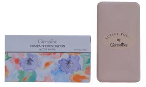
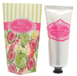
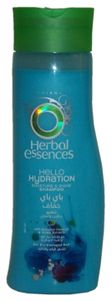
Giffarine Active Young Compact Foundation; Banks & Co Green Pear & Guava Hand and Nail Cream; The Clairol Herbal Essences Hello Hydration Shampoo
What we think
As consumers seek to achieve balance, well-being and healthy looks from their beauty and personal care products, the 2016 Pantone colors Rose Quartz and Serenity might be the perfect combination to convey this message. Joined together, these two colors embrace the warmer rose tone and the cooler tranquil blue. Color blurring will offer inspiration for novel package designs or new variations of existing designs such as watercolors. Rose Quartz and Serenity are likely to fit with many natural products that want to express product attributes through modern package designs and stand out on shelf.
Viktorija Gnatoka is a Global Packaging Analyst at Mintel, where she is responsible for delivering packaging insights and actionable recommendations across multiple categories.
-
 Discover your next big breakthroughGet smart fast with our exclusive market research reports, delivering the latest data, innovation, trends and strategic recommendations....View Reports
 -
 2026 Global PredictionsOur Predictions go beyond traditional trend analysis. Download to get the predictive intelligence and strategic framework to shape the future of your industry in 2026 and beyond. ...Download now
 -
 Are you after more tailored solutions to help drive Consumer Demand, Market Expansion or Innovation Strategy?Ask for a customised strategic solution from Mintel Consulting today....Find out more


Free market intelligence downloads
-
Consumer ResearchDownload

The Visibility Gap™
Rooted in the US Midwest, South, and Southeast, the Missed Majority reflects a broader consumer mindset often underrepresented in the data signals brands rely on most.Download -
Consumer ResearchDownload
The Connection Economy
The UK has moved from omni- into permacrisis as economic pressure, geopolitical instability, the climate crisis and the accelerating race around AI have become part of everyday life.Download -
Consumer ResearchDownload
The New World of Wellness from Mintel
Gain a complete view of the wellness marketplace and unlock wellness opportunities with predictive insight, thought leadership and the direction to fuel growth.Download -
Consumer ResearchDownload
2026 Global Consumer Predictions
Explore three bold Consumer Predictions that reveal how consumers are redefining their lives, identities, and how they connect with brands through 2030 and beyond.Download -
Food and DrinkDownload
2026 Global Food & Drink Predictions
Learn the three Food & Drink Predictions that will define the next era of the F&D industry. Insights to empower you to anticipate change, inspire action and lead the industry into the future.Download -
Food and DrinkDownload
The Next BIG Whitespace in Drinks
Discover the next big opportunity in carbonated soft drinks (CSDs) and learn how brands can move first in this space with this new report.Download -
Beauty and Personal CareDownload
5 Beauty & Personal Care Demand Signals
Explore the emerging beauty trends shaping 2026 and the opportunities brands should be watching now in this report from Black Swan Data.Download -
Food and DrinkDownload
5 Food and Drink Mega‑Trends for 2026/27
From flavour cues, to cultural influences, uncover the 5 Food & Drink trends transforming 2026/27 with this new insight report powered by Black Swan social intelligence.Download