When every pack promises better sleep or easier digestion, the claim alone won’t win the shopper. Here’s what decides which benefit gets seen, felt and remembered:
Walk down any supermarket aisle and you’ll see it: packs that lead with what a product does for you – better sleep, easier digestion, steady energy – rather than what it is. Mintel GNPD shows energy claims on 37% of functional food and drink launches across Europe in 2025, rising to 44% of functional drinks. Shoppers are starting with a need and working back to a product.
At Dragonfly AI, we measure how people see, feel about and remember packaging, so this shift raises an obvious question for us. If everyone is making the same promise, what makes one pack the one that gets picked? In Great Britain, only health claims on the government’s authorised register can be used on food, so many packs end up saying the same thing in similar words.
The claim won’t set you apart. Being seen, understood and remembered will.
What decides whether a benefit lands?
Our research points to four things:
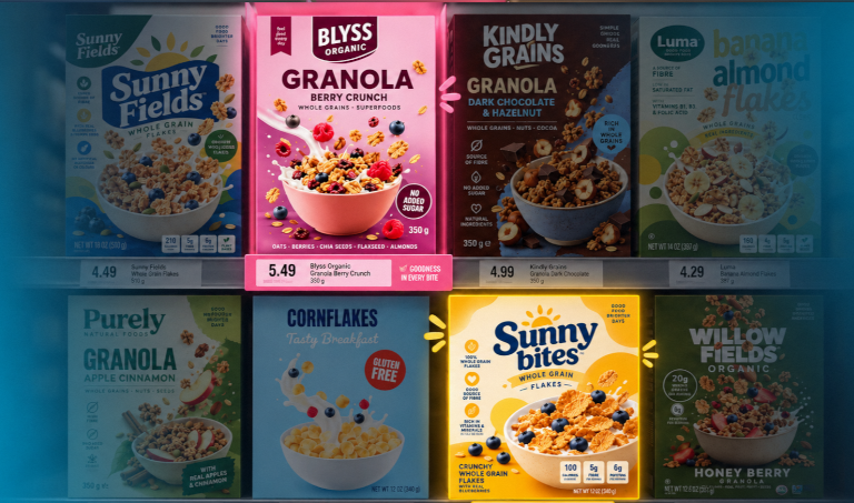
- Attention is won before shoppers think. On a busy shelf, most packs are never consciously processed. Whether something gets seen is settled in milliseconds, by automatic responses to orientation, colour, texture and scale. A benefit has to win that contest before anyone reads it.
- Standing out depends on what’s around you. The influence of each visual cue is never fixed. A bright colour stands out in a muted scene but disappears in a colourful one. On a fixture where every gut-health pack uses similar cues, design choices that work alone stop working together.
- Being noticed isn’t the whole story. When Calbee temporarily moved some packs to black and white, we analysed both versions. The monochrome pack held Attention at 100%, but Emotion fell from 84% to 20% and overall Creative Impact dropped from 99% to 68%. A pack can stop the eye and still fail to make people feel anything – and emotion is a key driver of what gets remembered.
- How the words look matters as much as what they say. The 42 creative characteristics behind our Memory and Emotion models include 14 language factors, such as text contrast, layout, language complexity and semantic concreteness. A benefit in plain, concrete, high-contrast wording does more work than the same claim in small, technical copy.
Being seen pays
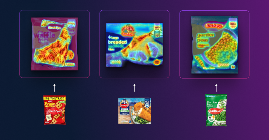
Birds Eye tested its first major redesign in over a decade on real supermarket shelves before rollout. In the potato aisle, the new packs were 14.5% better at catching attention than the ones they replaced, and 45% more likely to win attention than competitors.
Across 22,620 campaigns, our validation study found every 10% increase in Attention score delivered a 15–16% uplift in click-through, and every 10% increase in Memory added 8–9%. Optimising for Attention, Emotion and Memory together lifted performance by up to 41%.
The same holds when the pack goes online. A leading food and drink supplier redesigned one hero image for the Tesco.com search page and saw a 70% conversion lift on that milk line.
What does this mean for brands?
- Start with the need, not the aisle. Map which needs your product meets and who else answers them, including brands from other categories.
- Make the benefit win attention first. Give it the colour, contrast and scale to compete before anyone reads it.
- Judge packs in context. Test against the real fixture they will sit on, not on a blank screen.
- Check it makes people feel something. As the Calbee packs showed, attention without emotion is easily lost.
- Test before launch, not after. Checking packs on a realistic shelf before print, as Birds Eye did, means problems are caught while they can still be fixed.
- Categories won’t disappear. But the brands that grow will be the ones whose benefit is seen first, understood quickly and remembered at the moment of choice.
Want to know how your packs will perform on shelf? Explore more packaging and attention insight on the Dragonfly AI blog